Wednesday, June 8, 2011

It's All in the Details

I love Allison Davis's sketches.  And I love Jennifer De Wolfe's scrapbooking style.  So, what better thing to do than to scraplift one of Jennifer's layouts based on one of Allison's sketches?!  Here is my layout, called "It's All in the Details".


I have so many photos left to scrap from our road trip last year so I decided to use some of them for this challenge.  Instead of a "typical" travel page, I chose to focus in on some of the details.  I used Katie Pertiet's "Grass, Sand n Sea" papers, the flowers are from kits by Julie Billingsley, Melissa Bennett and Eva Kipler and the border punch is from Splendid Finns.

And here's Jennifer's layout, "Starting Now":


And here's the link to the original sketch (#11).


Tuesday, June 7, 2011

Jamaica Day Pre-K Style

I did this layout for the weekly challenge at Club CK to lift a layout posted to the Layout Lottery thread. I chose to lift this layout by my friend, Laurie:


I love the simplicity of it and how classy it looks.

For my layout, I did the left-hand page as my lift and then made a second page to go with it to incorporate all the pictures I wanted to use.  My layout doesn't have the classy feel that Laurie's has but I really like how it turned out.


I did this layout about K's first school-wide event back in October.  The whole school had prepared presentations for the parents to celebrate Jamaica Day.  K's class danced the Maypole Dance with the Grade 5 students and it was the sweetest thing!  And our sweet little girl who was so terribly shy and still crying every morning about going to school surprised us so much on stage.  She came out with the other kids and skipped across the stage and had an absolute blast doing their dance.  She had a big grin on her face the whole time.  That's when we realized that she must be the kind whose place is the stage.  :)

I used a mish-mash of products from several of the digi kits I have:  "Animal Farm" and "Festive in Green" by Heather Roselli; "Mouse Mania" and "Find Your Wings" by Julie Billingsley; "Artistic U" by Melissa Bennett; "Tutu Cute" by Just So Scrappy and "Hobby of Memories" from JDS.


I took the same yellow alpha I used for the first part of the title and recoloured them for the second part because there was too much yellow had I kept it.  I love so much that I've learned how to do that!!!

Technique Tuesday

Over at Club CK, we are going to start doing Technique Tuesday.  Every week, a member will share a technique that she developed or found.  It'll be a fun way to share different scrappy things.

I came across a tutorial on making Ric Rac flowers over at Skrap 'n Chat.  I loved how they looked so I thought I'd give it a whirl.  I have to admit that the first one was really tricky and I had to start over about three times.

What do you need for the flowers?
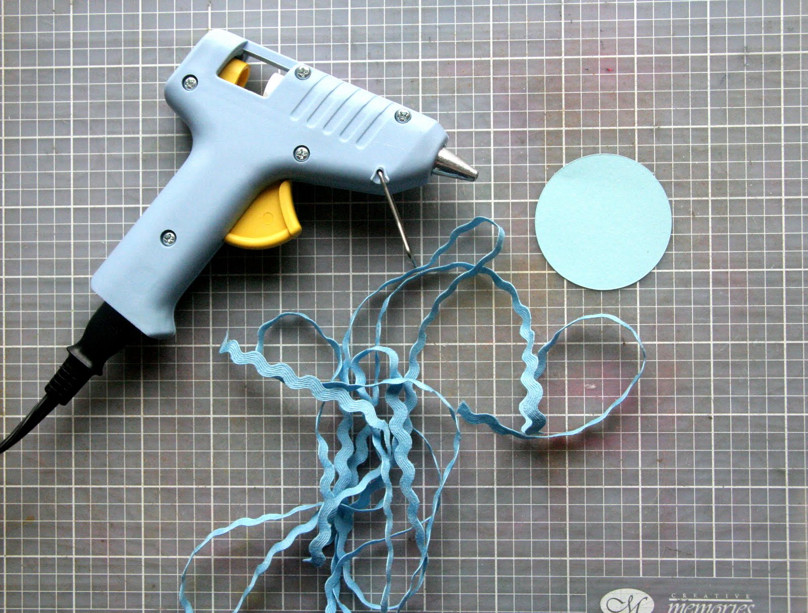
* Hot glue gun
* Circle (mine was 2" for the first one; the smaller the circle, the tougher to wrap)
* A lot of ric rac
* Something to finish off the flower - button, brad, paper circle, etc.


Here are my tips before starting:

* Use ric rac that isn't too stiff.  For the first flower I did, I used bigger ric rac and it was pretty stiff.  It made it tough to wrap it tight.  
* Use just a little glue at a time.  I found it better to just squirt a bit at a time and then wrap slowly.  That way you can get the ric rac more even and avoid gaps.  
*  You don't want the ric rac straight up or flat so you need to play around a bit with how you want it.

Step 1:  Squirt some glue in the centre of the circle.


Step 2:  Start wrapping the ric rac from centre.  Keep it tight to start.   Keep the "v"s tight at the bottom.  


Step 3:  Just keep wrapping it around.  Try to do it tight enough to not have gaps but not too tight or it will get quite thick.


Here's what it looks like as you're going:


Step 4:  When you've finished, just trim the ric rac and then trim the cardstock back so you don't see it.


Step 5:  Finish it off with a button or brad.


The flower on the right was my first one.  You can see it's standing up more than the one on the left.


Monday, June 6, 2011

Juicy Goodness

This was for a fast scrap challenge over at Skrap 'n Chat to do a scraplift of one of Kirsten's layouts.  I got the layout done in less than an hour, which is great for me.  (Doing that 15-minute challenge must have helped me!)


The initial layout didn't have the stitching on the strips or the circle, which is why I was able to get it done in an hour.  However, I felt like something was missing, so I decided to add the stitching to add a little more texture.  I used Lynn Grieveson's "French Summer" digi kit.

I don't usually do a layout with so much white space but I am happy with how this turned out.  

Sunday, June 5, 2011

Daddy & Me

This layout is of D with A on our hike at Las Siete Tazas in Chile.  It was such a great hike and I got some good pictures of the two of them.  I'm getting D to think of the journalling he wants on this page and write it himself.  I want the kids to have a few samples of their daddy's handwriting, not just mine.

Saturday, June 4, 2011

Scraplift #1

A friend of mine did a "Study of the Masters" for a few months earlier this year.  Her goal was to choose layouts done by the "experts" in the field and copy their design so she could learn about design better.  Her style and knowledge evolved and she was very happy with the process.  When I heard of her doing it and then seeing her layouts, I knew that this is something I should be doing also.

Though I'm not going to do it for every layout, I have started with my own version of studying the masters.  I lifted this layout from Laura Vegas from CK's Tips & Tricks Tools and Techniques 2010 magazine.


And here is my version.  I wish I had more patterned paper that I could have used with this because I think the thicker strip would have looked better with a pattern.  But that's what you get when you are limited in your paper purchasing - you make do with what you've got.  I also think the journalling would have looked better with a stamped shape around it but I don't have that either.  I suppose I could have drawn it in myself but I didn't think of that before I started writing.  lol


Thursday, June 2, 2011

Sketch It To Me Blog Hop

Welcome to the Sketch It To Me blog hop!  If you've been hopping along, you have seen some fantastic layouts and projects.  You've likely arrived from Melissa's blog but if you haven't, you can go to Amanda's blog to start off at the beginning:  http://www.lovejoypaper.com/.

We all started off with a sketch and were asked to make one layout and one other project based off of it. Here is the sketch:

And here is my layout based off of it:


I stayed pretty true to the sketch.  The only things I did differently were to add the journalling spot, the raffia as a photo wrap and ric rac over the border strips.

I used Mindy Terasawa's "Howdy Cowboy" kit (from Designer Digitals) for this layout.  I love it - it's such a fun kit to work with.  My DD used to take horse riding lessons (she started when she turned 3 and rode for a year) so I wanted to get a page done about that experience for her.

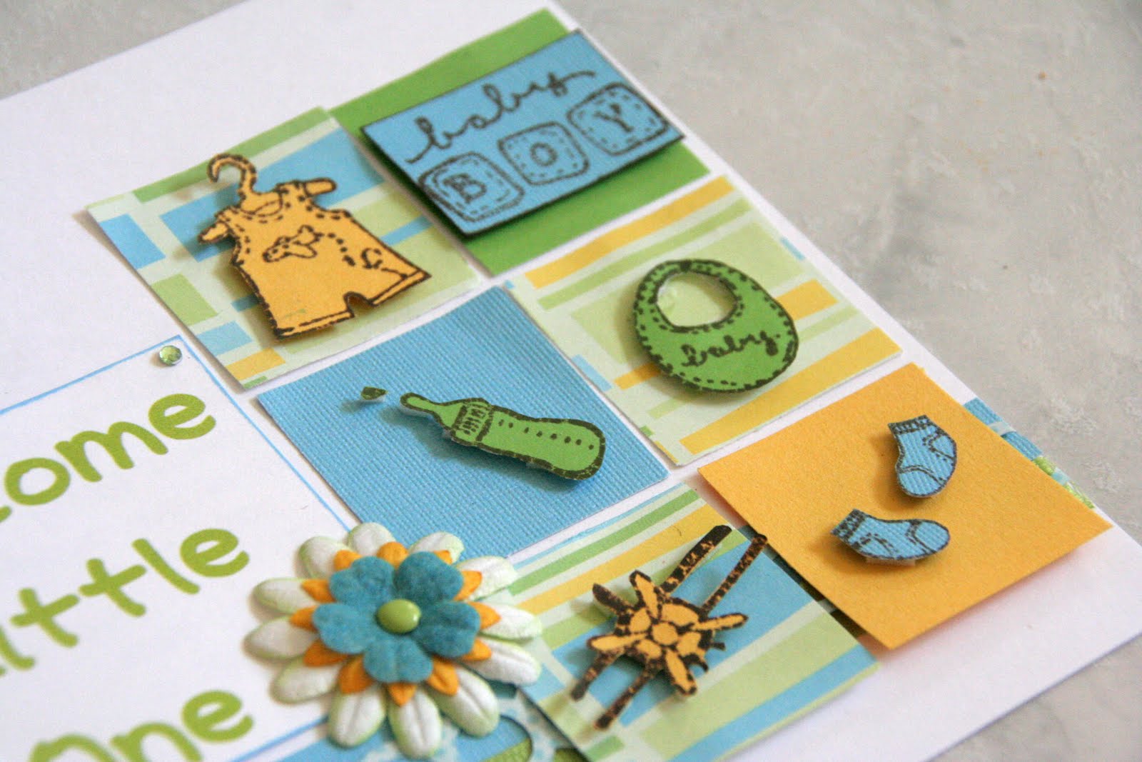
The second project I did was to make a card.  I find cards very difficult to make and I spend more time making a card than I do a layout, if you can believe it!  I find that I fuss so much more with a card and it just doesn't come naturally to me.  But, I'm glad I did one as I'm hoping that the more I do, the easier it will get (fingers crossed, at least).  And here's my card:


I changed up the sketch for my card.  I left out the circles on the right-hand side and I made six small blocks instead of three small ones and a big one.  I put the sentiment on a title block and added in a flower there.  I used scraps of paper for all of it and I decided to do some stamping.  I have some baby stamps so I stamped the images on to cardstock and then cut them out.  Then I adhered them with foam onto the blocks.  I used the stamped buttons as the circle cluster at the top.


And that's it for my projects!  I hope you enjoyed your stop here.  Make sure to leave a comment to be entered for Amanda's giveaway.  Your next stop is at Jennifer's blog:  http://scrapdrawer.blogspot.com/.  I'm sure she has some great projects in store for you!  Thanks for stopping by and Happy Hopping!

Zoom, Zoom, Zoom!

Park pictures with little ones - who doesn't love them?  :D  These pictures of when we went to a new park and A finally decided that he liked the slide.  Look at the smile on his face!


I used Stickles on the title, just to give it a little sparkle.


I used my "bubble" border punch and then filled some of the holes with orange gems.


All the chipboard - flowers, arrow, bracket, dots - are from a Pebbles pack that I got from a RAK.  I've used them so much.  I also included hidden journalling behind one photo.  Not that the journalling is very personalized but it didn't fit into my design.

Wednesday, June 1, 2011

El Huasito Aidan

I did this layout of when we went shopping for woollen and knitted clothes just north of Santiago.  We got A this little hauso (Chilean for cowboy) poncho but we tried on lots of other sweet clothes too!


These dimension flower stickers are from the "Wild Saffron" collection from K&Company.  I just love that collection!


And I actually misted here!  Yep, I pulled out my sole bottle of Smooch Spritz and misted the journalling spot.  That is one look I really like with mist.


I used my Leave It To Weaver punch to do the border at the bottom.  I threaded brown ribbon through it and then added small flower stickers from the same "Wild Saffron" pack.

Tuesday, May 31, 2011

Big Yawn

I started this layout back on iNSD.  I love these pictures of A yawning when he was a teeny tiny baby!  I started out by adding some blue ink along the top and bottom edges of the photos to serve as a mat.  Then I added the photos and the paper blocks.  The ric rac and buttons came next.  After that, I added the title, then the stitching and finally the journalling.


I added the flower on the title block but felt it needed something else so I added some flourishes to act as leaves.  The font I used for the title is Ravie and for the journalling, I used 2Peas Rubber Ducky.


I really like how the buttons turned out.  I wanted them to serve as a small border along the bottom.

Monday, May 30, 2011

Faces

I did this layout for a recipe challenge at Club CK.  Ashley asked us to include the colour yellow - check, chipboard - check, ribbon or floss - check, at least three buttons - check, letter stickers - check and glitter or Stickles - check!


The toughest part of this layout was trying to use letter stickers.  I never use them anymore but still have some in my stash.  I had no coordinating colours so I decided to put Stickles on the stickers to get them to match.  It worked out OK, but I'm still not a fan of letter stickers!  lol  I really couldn't think of a title for this layout - I just thought the expressions on A's face were so cute.  So, I journalled about that (on this super cute Jillibean Soup journalling spot) and then came up with a short, though boring, title based on that.  I needed to add something to the title area, so I put the stickers on a strip of ribbon, added buttons with yellow floss to either side and then a semi-circle of gems.  They aren't turquoise but they go with the background paper and I'm trying to get past my "everything has to match perfectly" hangup.


I used this little circle from the same Jillibean Soup pack and then mounted a small chipboard flower and then button on it.  I used foam to mount them all to give it dimension.


I love the journalling spot but it looked too plain by itself.  So, I decided to stitch a "border" around the scalloped circle.

Sunday, May 29, 2011

15-Minute Challenge

For this week's issue challenge, Erika asked us to do a layout in 15 minutes.  Yes, 15 minutes.  If you know me, I am a sssslllloooowwww scrapper.  I take forever to choose the papers to go with the pictures, then the embellies and then putting it all together.  Paper layouts take me much longer than digi ones but I'm still not speedy with digi layouts.  I still like to play around with the elements and then the shadowing.

So this challenge was an anxiety-provoking challenge for me but I wanted to give it a shot.  I chose the photos and the digi kit ("Leaps and Bounds" by Julie Billingsley) ahead of time.  I chose them a couple days ago and then let it be.  I sat down and started the timer.  I decided to forget about layering - not going to happen when I'm pressed for time.  So I went with a simple photo block and then the starburst, the buttons and the title.  I fussed around with the alphas to space them evenly and then line them up properly - I couldn't let that go - it would have driven me nuts.  I see the blue button is a little off but oh well, it's not too bad.  I couldn't let this layout go without journalling.  Yes, I'm a journalling junkie but I have to tell the stories to go with the photos.  There are layouts that I don't feel need journalling but this one wasn't one of those.


And you know what?  I'm really happy with it!  I need to do this more often.  :)

Saturday, May 28, 2011

March 2011

I decided that since I got pretty much caught up with our family monthly collages, I should not let myself get further behind.  So, tonight I sat down and did March of this year.  This weekend, I need to get April done so that I can get May done soon after.

You can see that March was a low-key month for us, which resulted in fewer pages than I think we've had since I started this.  However, April will be packed full with fun stuff.  So, here they are:


Friday, May 27, 2011

Who's at the Zoo?

Over at Skrap 'n Chat, Suzanne posted a challenge to find a layout that you did quite a while ago that you still love and scraplift it.  What a great idea!  So, I went through my albums from our Middle Eastern trips and found this one I did of Der's trip to Wadi Rum.  Love the placement of the pictures and the colours.


And here's the layout I did based on it.  I stayed very true to the placement of the pictures and the torn edges.  I did add a few embellies as I've now embraced embellishments more than I used to.  :)  I used Just So Scrappy's "Who's at the Zoo" kit.  Funnily enough, I didn't even know what the kit's name was until after I'd finished my layout!  I also used the torn paper templates from Anna Aspnes.

Thursday, May 26, 2011

Jump, Jump, Jump!

I did this layout for the May Colour Challenge held over at Club CK.  Merry challenged us to use blue, green and orange.  I just bought the "Refreshing" kit by JennCK Designs and I thought it'd be perfect for this challenge.


I wanted some fun pictures to go with those colours so I chose these ones of the kids on the trampoline.  Once I chose the photos, I realized that they would work well with the sketch challenge in the Issue Challenge #2 (at Club CK) and with the Issue Challenge #1 for using imperfect photos.

All the elements are from the kit except for the fonts, which I downloaded (most likely) from DaFont.com and the border punches are from Julie Billingsley.  I made the butterfly trails using a straight stitch brush from Jessica Sprague.

I'm really happy with how it turned out - I wanted to give a fun, carefree feel to the layout and that's how it feels to me.

Wednesday, May 25, 2011

Our New Family

This was our first family photo after A was born.  We didn't get one done right away - it sort-of fell to the wayside while getting used to life with a family of four.  We did get it taken within his first week of life though.  ;)  I wanted an elegant look and came up with this:


I used these epoxy stickers that my friend, Diana, gave me at our crop a couple weeks ago.  The go perfectly with the flourishes on the paper.  I backed them with navy textured cardstock and then mounted them on foam dots.

I used another of these stickers along with three glittery brads along the side of the photo.


And some Stickles to highlight three flowers on the paper and some lace as trim underneath the photo.