This layout was for June's layout tag over at Skrap 'n Chat. There are so many of those little moments photos that I want to scrap and these were two of those photos. A has been having lots of fun building with Legos so I wanted to snap some photos of that. I decided that I'd like to try different stuff - especially that stitched border around the page. Not sure if it's my favourite but I do like it for this page.
I used Heather Roselli's "Busy Little Boys" digi kit for this layout.
Since we'll be travelling in the next few days, you won't be getting many updates from here for a while. But hopefully I can still manage to get some stuff done!
Wednesday, June 22, 2011
Tuesday, June 21, 2011
Cards
I'm so not a card maker but I've decided that I need to try. I just don't find it natural and coming up with ideas for them is really tough. However, I've had a few things where I needed cards so I decided to sit down and really focus.
This one is what D got for Father's Day. Very simple but it works. The stamped message and the rounded corners are what make this card for me. And I painted the edge of the card and then inked the edge of the message mat.
Little A's birthday was yesterday so I needed to make a birthday card for him. I wasn't sure what I wanted to do for it, so I kept it simple with a strip and the border strips and a few buttons. I used old letter stickers and painted them brown to go with the card.
For K's birthday card, I wasn't sure what to do so once again, I kept it simple. I cut out the flower block from some patterned paper that I had in my stash and added a pink gem. I put them on a couple strips and done!
And the best thing? I used scraps for all of these cards. Woo hoo!
My favourite card is this one that I did for our anniversary back in May. I did do it on time but hadn't taken a picture of it! lol I really like how it all came together - the circular card, the colours, the flower, the stitching on the title mat, the little stamped birdie.
So, what I'm starting to realize is that for me to be able to do cards and actually semi-enjoy it, I need to keep it simple. I can't overthink it and I just need to keep the fancy stuff to a minimum. Maybe one day I can start doing fancier ones but at least I've come to terms with what my card style is and can work with it.
This one is what D got for Father's Day. Very simple but it works. The stamped message and the rounded corners are what make this card for me. And I painted the edge of the card and then inked the edge of the message mat.
Little A's birthday was yesterday so I needed to make a birthday card for him. I wasn't sure what I wanted to do for it, so I kept it simple with a strip and the border strips and a few buttons. I used old letter stickers and painted them brown to go with the card.
For K's birthday card, I wasn't sure what to do so once again, I kept it simple. I cut out the flower block from some patterned paper that I had in my stash and added a pink gem. I put them on a couple strips and done!
And the best thing? I used scraps for all of these cards. Woo hoo!
My favourite card is this one that I did for our anniversary back in May. I did do it on time but hadn't taken a picture of it! lol I really like how it all came together - the circular card, the colours, the flower, the stitching on the title mat, the little stamped birdie.
So, what I'm starting to realize is that for me to be able to do cards and actually semi-enjoy it, I need to keep it simple. I can't overthink it and I just need to keep the fancy stuff to a minimum. Maybe one day I can start doing fancier ones but at least I've come to terms with what my card style is and can work with it.
Monday, June 20, 2011
Daddy & Me
In celebration of our little boy's birthday today, I thought I'd post this layout that I did of Daddy and A on his first hike. A very simple page but I didn't think it needed anything else.
Since this page was about Daddy and A, I got Daddy to do the journalling. Not only is it in his handwriting, it's his feelings about their relationship. I really think that we need to do this. Get your significant other's or children's opinion or feelings on things and add them to your scrapbook pages once in a while. and if you can get them to write the journalling, even better!
Sunday, June 19, 2011
Mim-musement
There's a really cool children's museum in Santiago called the MIM (Museo Interactivo Mirador). Most of it was for older kids but there was a whole area for the little ones and even the babies had a great time. I used primary colours for the first time and I really like the look of it! I wanted to go with the ring theme so I cut out the rings along the bottom as a border, the brads and the stitched circles on the red border. I wasn't sure what to do with the trapped space below the title but my good friends at Club CK gave me the idea of journalling strips and I love it now!
Another idea from friends at Club CK - putting a few brads along the edge of one of the rings. Love it!
My favourite part of this layout is the stitched border. It took me forever to do but I love the look of it!
I love foam adhesive - just adds the perfect dimension to embellies and alphas.
Another idea from friends at Club CK - putting a few brads along the edge of one of the rings. Love it!
My favourite part of this layout is the stitched border. It took me forever to do but I love the look of it!
Saturday, June 18, 2011
Fun Times
This layout was for another round of layout tag. I was second in line so I worked off my friend, Merry's, layout. I decided to do some pictures from Nana and Papa's visit earlier this year. I added in the banner instead of a flourish since it worked better with my pics. And I'm still loving my digi mist masks!
Supplies: "Crazy Good" digi kit from Melissa Bennett and Eva Kipler
Banner template from Dani Mogstad
Scalloped circle from Julie Billingsley
Mist Mask from Gennifer Bursett
Supplies: "Crazy Good" digi kit from Melissa Bennett and Eva Kipler
Banner template from Dani Mogstad
Scalloped circle from Julie Billingsley
Mist Mask from Gennifer Bursett
Friday, June 17, 2011
Simple Page
As you know, I've been doing some work on our Road Trip album. We take lots of pictures, I mean A LOT! But having those moments captured allow us to remember the small details about our trips. But sometimes, those pictures aren't the best quality or there are just so many of them that doing fancy pages for all the photos just isn't feasible. These photos that we have on our drive from Frutillar to Valdivia aren't great - in fact, all of them were taken on the go and so the angles aren't perfect and some of them are a bit blurry. But I still wanted to include them in our album, for the memories since that's what scrapbooking is for me. I have this template from Cathy Zielske that worked perfectly for them.
The only thing I added was the dotted border around the pictures, also from Cathy Z. The papers are freebies from Katie Pertiet, over at Designer Digitals community challenges.
I love doing more creative things with my photos as scrapbooking is my only creative outlet and I love the feeling I get from a cute page I've done. However, I don't think that all pages need to be creative, in my sense of them. Sometimes, just a focus on the photos with the story and none of the fluff is perfect. My monthly collages are the perfect example of this. I love doing them - we see our lives that month in pictures with some of the details recorded. And even better is that they're fast to do. So, that sense of accomplishment is wonderful.
I've come to realize that a mix of creative and simple is what I want for my scrapbooks. I don't expect to love every page and that's fine. If you're trying to keep up or make up some ground with your photos as well as using scrapbooking as your creative outlet, I don't know if it's possible to love every page. I'm such a slow scrapbooker, especially with paper, that I'd be spending even more time than I do on each layout trying to get it so I love it. As long as I don't hate it, it's good. And my latest realization is that I can love those simple pages too, just as much as the ones where I add lots of embellies, borders and all the fun stuff.
The only thing I added was the dotted border around the pictures, also from Cathy Z. The papers are freebies from Katie Pertiet, over at Designer Digitals community challenges.
I love doing more creative things with my photos as scrapbooking is my only creative outlet and I love the feeling I get from a cute page I've done. However, I don't think that all pages need to be creative, in my sense of them. Sometimes, just a focus on the photos with the story and none of the fluff is perfect. My monthly collages are the perfect example of this. I love doing them - we see our lives that month in pictures with some of the details recorded. And even better is that they're fast to do. So, that sense of accomplishment is wonderful.
I've come to realize that a mix of creative and simple is what I want for my scrapbooks. I don't expect to love every page and that's fine. If you're trying to keep up or make up some ground with your photos as well as using scrapbooking as your creative outlet, I don't know if it's possible to love every page. I'm such a slow scrapbooker, especially with paper, that I'd be spending even more time than I do on each layout trying to get it so I love it. As long as I don't hate it, it's good. And my latest realization is that I can love those simple pages too, just as much as the ones where I add lots of embellies, borders and all the fun stuff.
Thursday, June 16, 2011
Peek-a-Boo!
I did this layout quite a while ago for a session of May layout tag at Skrap 'n Chat. You're given a sketch or a layout to scraplift and it gets passed along. I was the first on the list this time and it was a sketch with just one photo so I decided to choose one of my favourites. I haven't done any of K's pictures in the year after she turned one so I thought I'd go back and choose one from there.
Pink Scallop and Pink Jewel Flower: Kristin Cronin Barrow's "Scoop It Up"
Pin: Jessica Sprague "Now We're Rockin'" digi class
White Button and Ribbon: Heather Roselli's "Busy Little Boys"
Purple Felt Heart: Pattie Knox's "Have a Heart"
K: Mindy Terasawa's "Howdy Cowboy"
As you know, this isn't really my style, with so much white space. However, I love the colours and the little splash of digi paint that I used. :)
I used a little bit from a whole bunch of digi supplies on this layout:
Background Paper: Katie Pertiet's "Joulunaika Solids"
Patterned Paper and Purple Button: Julie Billingsley's "Bumbleblooms"
Blue Paper and Blue Paint: Julie Billingsley's "Leaps and Bounds"Pink Scallop and Pink Jewel Flower: Kristin Cronin Barrow's "Scoop It Up"
Pin: Jessica Sprague "Now We're Rockin'" digi class
White Button and Ribbon: Heather Roselli's "Busy Little Boys"
Purple Felt Heart: Pattie Knox's "Have a Heart"
K: Mindy Terasawa's "Howdy Cowboy"
Wednesday, June 15, 2011
More Chilote Churches
I'm a big fan of sketches - just love them. My favourite inspirations are Sketch Support and Page Maps. There are so many sketch sites out there so there are many to choose from. Though I'm not usually a fan of their sketches as they are too artsy for my style, Sketchy Thursdays has a great sketch that totally suits me. Here's their sketch:
It's clean and linear with minimal "fluff" - so me! lol
Lately, I've been working behind the scenes on our Road Trip album. What I mean by that is I'm trying a new system to help my layouts not look the same. While I was doing the part in Argentina, I felt like the pages were all starting to look the same. So, rather than create each layout, one at a time, I decided to sort the pictures I wanted to use by category. I'm working on the Chiloe section now so I subdivided the pics into these categories: agriculture, Penguin Cove, cabins, churches, sunset, etc. Then I either found sketches or designed the pages based on how many pictures there were and the orientation of the pictures. It's very systematic and quite assembly-line like but honestly, I'm liking it so much more. It helps me to have more variety in the design of the layouts.
So, with that said, this layout is of some of the churches we went to see in Chiloe. This first page is pretty much an exact replica of the sketch.
And then, of course, I had to stretch it out to a second page and came up with this:
I used Julie Billingsley's "Find Your Wings" digi kit for the layout. I also used one of Misty Cato's sanded overlays for the little paper strips, a scalloped mat from Miss Mint, a border strip from Splendid Finns and Jessica Sprague's straight stitch brush.
It's clean and linear with minimal "fluff" - so me! lol
Lately, I've been working behind the scenes on our Road Trip album. What I mean by that is I'm trying a new system to help my layouts not look the same. While I was doing the part in Argentina, I felt like the pages were all starting to look the same. So, rather than create each layout, one at a time, I decided to sort the pictures I wanted to use by category. I'm working on the Chiloe section now so I subdivided the pics into these categories: agriculture, Penguin Cove, cabins, churches, sunset, etc. Then I either found sketches or designed the pages based on how many pictures there were and the orientation of the pictures. It's very systematic and quite assembly-line like but honestly, I'm liking it so much more. It helps me to have more variety in the design of the layouts.
So, with that said, this layout is of some of the churches we went to see in Chiloe. This first page is pretty much an exact replica of the sketch.
And then, of course, I had to stretch it out to a second page and came up with this:
I used Julie Billingsley's "Find Your Wings" digi kit for the layout. I also used one of Misty Cato's sanded overlays for the little paper strips, a scalloped mat from Miss Mint, a border strip from Splendid Finns and Jessica Sprague's straight stitch brush.
Tuesday, June 14, 2011
Churches of Chiloe
This is the first of many layouts that are for our Road Trip album from last year. I was going great guns with it for a while and then I stopped. I just needed a break from the travel pictures. As much as I love scrapping them, I've figured out that I need variety in my scrapping themes to stay motivated. So after several months of being stalled, I've picked it up again.
In Chiloe, many of the churches are built completely of wood - not just made of wood but completely fitted together with wood plugs instead of nails. Sixteen of the 150 wooden churches in Chiloe have been declared World Heritage Sites by UNESCO. If tourists travel to Chiloe, they will often stop at the churches to see the impressive architecture. Even though this was our second time to Chiloe, we still wanted to stop and see the churches. It's so neat to see that these churches are still standing, after 250+ years after being built. Amazing.
Monday, June 13, 2011
Beauty of the Blue Mountains
When we visited a coffee estate not too far from Kingston, we not only loved the tour we got but the estate itself was so beautiful. When we got there, the dew was still on the flowers and that gave the flowers such an alive feeling - they were screaming to be photographed! :D We loved the gorgeous landscaping at the estate and the variety of the flowers.
So, when I saw this template over at Sweet Shoppe Designs by Janet Phillips I knew it would be the perfect design to showcase our photos. Simple, let the photos be the focus yet allowing for some journalling.
The digi kit I used was "Le Jardin" from Misty Cato. I actually had done the layout using another kit but I wasn't too happy with the colours and patterns so I tried this kit out. I love the dark brown background with the other natural colours to accent the page and the photos. The scalloped border is the one I use all.the.time - from Julie Billingsley. It's my go-to scallop border. The dashed border is the one I just picked up by Cathy Zielske - I can tell I'll be using those borders often too. I love the look of them!
So, when I saw this template over at Sweet Shoppe Designs by Janet Phillips I knew it would be the perfect design to showcase our photos. Simple, let the photos be the focus yet allowing for some journalling.
The digi kit I used was "Le Jardin" from Misty Cato. I actually had done the layout using another kit but I wasn't too happy with the colours and patterns so I tried this kit out. I love the dark brown background with the other natural colours to accent the page and the photos. The scalloped border is the one I use all.the.time - from Julie Billingsley. It's my go-to scallop border. The dashed border is the one I just picked up by Cathy Zielske - I can tell I'll be using those borders often too. I love the look of them!
Sunday, June 12, 2011
Cool Dude
The May sketch challenge at Skrap 'n Chat was this sketch:
I thought this sketch was perfect for a little boy page so I found this picture of A, one of my favourites, in his new digs from Asher and Liesl:
I used Katie Pertiet's "Little Tot" digi kit, which is so fun! The border punches are from Julie Billingsley - I've gotten so much use out of those border punches. I recoloured the paper for the journalling spot since none of the solids worked for it and I still wanted some texture. I finally figured out how to do that, with some help from Amanda :). Awesome!
I thought this sketch was perfect for a little boy page so I found this picture of A, one of my favourites, in his new digs from Asher and Liesl:
I used Katie Pertiet's "Little Tot" digi kit, which is so fun! The border punches are from Julie Billingsley - I've gotten so much use out of those border punches. I recoloured the paper for the journalling spot since none of the solids worked for it and I still wanted some texture. I finally figured out how to do that, with some help from Amanda :). Awesome!
Saturday, June 11, 2011
At The Lake
This week's issue challenge at Club CK is to use the colours navy blue, lime green and yellow, like was used on the layout on the cover of this issue of CK. I knew exactly which papers I'd be using - Echo Park's digi kit that I picked up at Jessica Sprague. I hadn't used it yet but I knew it would be perfect for this. I based this layout off a sketch from Page Maps, July 2010.
I did pictures of A at the lake last summer. I love, love, love that centre picture with Uncle D showing A how to fish. It's so sweet!
Friday, June 10, 2011
Decorate
I did this layout for the colour challenge for June. The colour combo? Grey, red and cream. I knew I had a digi kit with these colours so I dug it out and used it for the first time. It's a wintery kit from Katie Pertiet called "Joulunaika" and I love it. I just hadn't used it before so it was the perfect time. These pictures are from the Breakfast With Santa that we went to last year.
The title font is CK Heritage and the journalling font is Santa's Sleigh, from Dafont.com. It's based off a sketch from Page Maps.
Thursday, June 9, 2011
My Sis & Me
Over at Skrap 'n Chat, Karen challenged us to use no patterned paper or pre-made embellies. We could use stamps, mists, border punches, anything to make our own patterned paper. I didn't make my own patterned paper but I did break out the stamps to help me with this layout.
The green border is a stamp from a sentiments stamp sert from Close To My Heart. I hadn't ever used it on only part of the page so I made some boo-boos with the ink going over where I wanted it to, but I figured out what I needed to do after a couple times.
All these little bugs are stamps from Close To My Heart. They are just so darn cute but they are so darn tough to cut around, especially the antennae.
The green border is a stamp from a sentiments stamp sert from Close To My Heart. I hadn't ever used it on only part of the page so I made some boo-boos with the ink going over where I wanted it to, but I figured out what I needed to do after a couple times.
All these little bugs are stamps from Close To My Heart. They are just so darn cute but they are so darn tough to cut around, especially the antennae.
The little flourishes here are stamps from the same set:
Here, I wanted to add something with how long K's legs look, especially compared to teeny tiny A. So, out came the Stickles.
Wednesday, June 8, 2011
It's All in the Details
I love Allison Davis's sketches. And I love Jennifer De Wolfe's scrapbooking style. So, what better thing to do than to scraplift one of Jennifer's layouts based on one of Allison's sketches?! Here is my layout, called "It's All in the Details".
I have so many photos left to scrap from our road trip last year so I decided to use some of them for this challenge. Instead of a "typical" travel page, I chose to focus in on some of the details. I used Katie Pertiet's "Grass, Sand n Sea" papers, the flowers are from kits by Julie Billingsley, Melissa Bennett and Eva Kipler and the border punch is from Splendid Finns.
And here's Jennifer's layout, "Starting Now":
And here's the link to the original sketch (#11).
I have so many photos left to scrap from our road trip last year so I decided to use some of them for this challenge. Instead of a "typical" travel page, I chose to focus in on some of the details. I used Katie Pertiet's "Grass, Sand n Sea" papers, the flowers are from kits by Julie Billingsley, Melissa Bennett and Eva Kipler and the border punch is from Splendid Finns.
And here's Jennifer's layout, "Starting Now":
And here's the link to the original sketch (#11).
Tuesday, June 7, 2011
Jamaica Day Pre-K Style
I did this layout for the weekly challenge at Club CK to lift a layout posted to the Layout Lottery thread. I chose to lift this layout by my friend, Laurie:
I love the simplicity of it and how classy it looks.
For my layout, I did the left-hand page as my lift and then made a second page to go with it to incorporate all the pictures I wanted to use. My layout doesn't have the classy feel that Laurie's has but I really like how it turned out.
I did this layout about K's first school-wide event back in October. The whole school had prepared presentations for the parents to celebrate Jamaica Day. K's class danced the Maypole Dance with the Grade 5 students and it was the sweetest thing! And our sweet little girl who was so terribly shy and still crying every morning about going to school surprised us so much on stage. She came out with the other kids and skipped across the stage and had an absolute blast doing their dance. She had a big grin on her face the whole time. That's when we realized that she must be the kind whose place is the stage. :)
I used a mish-mash of products from several of the digi kits I have: "Animal Farm" and "Festive in Green" by Heather Roselli; "Mouse Mania" and "Find Your Wings" by Julie Billingsley; "Artistic U" by Melissa Bennett; "Tutu Cute" by Just So Scrappy and "Hobby of Memories" from JDS.
I took the same yellow alpha I used for the first part of the title and recoloured them for the second part because there was too much yellow had I kept it. I love so much that I've learned how to do that!!!
I love the simplicity of it and how classy it looks.
For my layout, I did the left-hand page as my lift and then made a second page to go with it to incorporate all the pictures I wanted to use. My layout doesn't have the classy feel that Laurie's has but I really like how it turned out.
I did this layout about K's first school-wide event back in October. The whole school had prepared presentations for the parents to celebrate Jamaica Day. K's class danced the Maypole Dance with the Grade 5 students and it was the sweetest thing! And our sweet little girl who was so terribly shy and still crying every morning about going to school surprised us so much on stage. She came out with the other kids and skipped across the stage and had an absolute blast doing their dance. She had a big grin on her face the whole time. That's when we realized that she must be the kind whose place is the stage. :)
I used a mish-mash of products from several of the digi kits I have: "Animal Farm" and "Festive in Green" by Heather Roselli; "Mouse Mania" and "Find Your Wings" by Julie Billingsley; "Artistic U" by Melissa Bennett; "Tutu Cute" by Just So Scrappy and "Hobby of Memories" from JDS.
I took the same yellow alpha I used for the first part of the title and recoloured them for the second part because there was too much yellow had I kept it. I love so much that I've learned how to do that!!!
Technique Tuesday
Over at Club CK, we are going to start doing Technique Tuesday. Every week, a member will share a technique that she developed or found. It'll be a fun way to share different scrappy things.
I came across a tutorial on making Ric Rac flowers over at Skrap 'n Chat. I loved how they looked so I thought I'd give it a whirl. I have to admit that the first one was really tricky and I had to start over about three times.
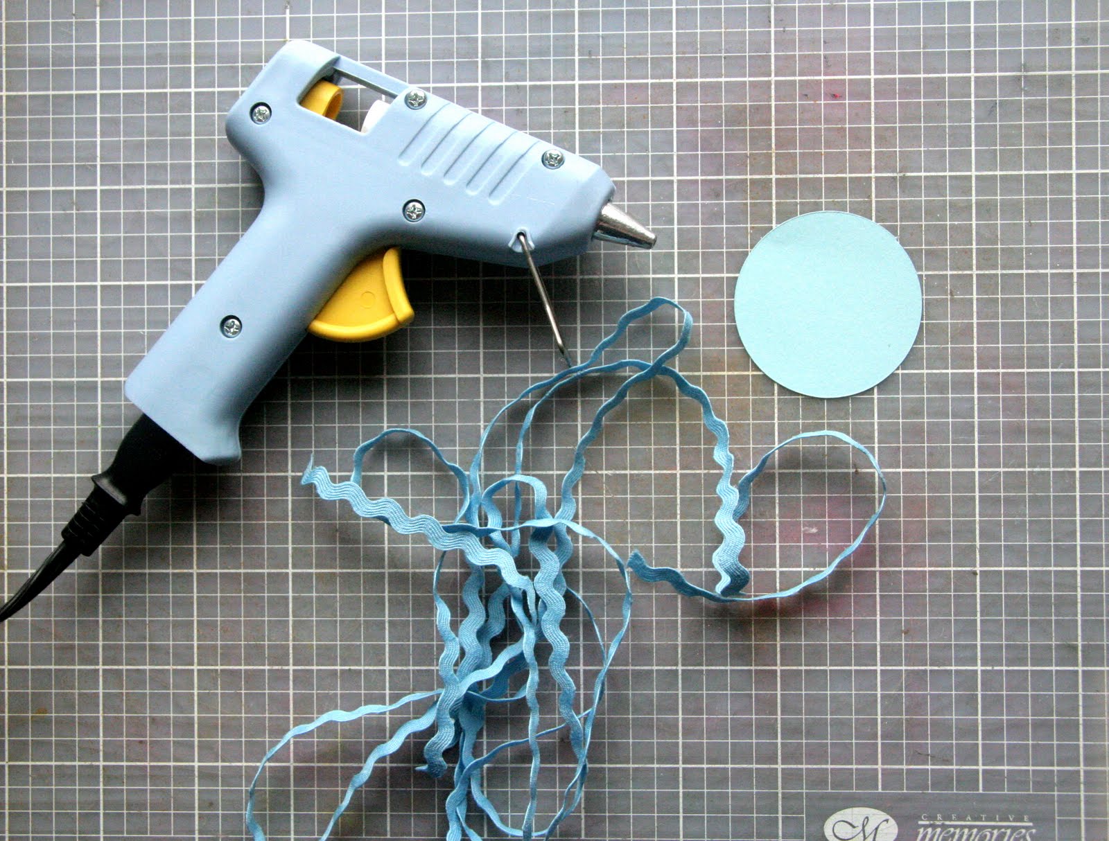
What do you need for the flowers?
* Hot glue gun
* Circle (mine was 2" for the first one; the smaller the circle, the tougher to wrap)
* A lot of ric rac
* Something to finish off the flower - button, brad, paper circle, etc.
Step 3: Just keep wrapping it around. Try to do it tight enough to not have gaps but not too tight or it will get quite thick.
Here's what it looks like as you're going:
Step 4: When you've finished, just trim the ric rac and then trim the cardstock back so you don't see it.
Step 5: Finish it off with a button or brad.
The flower on the right was my first one. You can see it's standing up more than the one on the left.
I came across a tutorial on making Ric Rac flowers over at Skrap 'n Chat. I loved how they looked so I thought I'd give it a whirl. I have to admit that the first one was really tricky and I had to start over about three times.
What do you need for the flowers?
* Hot glue gun
* Circle (mine was 2" for the first one; the smaller the circle, the tougher to wrap)
* A lot of ric rac
* Something to finish off the flower - button, brad, paper circle, etc.
Here are my tips before starting:
* Use ric rac that isn't too stiff. For the first flower I did, I used bigger ric rac and it was pretty stiff. It made it tough to wrap it tight.
* Use just a little glue at a time. I found it better to just squirt a bit at a time and then wrap slowly. That way you can get the ric rac more even and avoid gaps.
* You don't want the ric rac straight up or flat so you need to play around a bit with how you want it.
Step 1: Squirt some glue in the centre of the circle.
Step 2: Start wrapping the ric rac from centre. Keep it tight to start. Keep the "v"s tight at the bottom.
Step 3: Just keep wrapping it around. Try to do it tight enough to not have gaps but not too tight or it will get quite thick.
Here's what it looks like as you're going:
Step 4: When you've finished, just trim the ric rac and then trim the cardstock back so you don't see it.
Step 5: Finish it off with a button or brad.
The flower on the right was my first one. You can see it's standing up more than the one on the left.
Monday, June 6, 2011
Juicy Goodness
This was for a fast scrap challenge over at Skrap 'n Chat to do a scraplift of one of Kirsten's layouts. I got the layout done in less than an hour, which is great for me. (Doing that 15-minute challenge must have helped me!)
The initial layout didn't have the stitching on the strips or the circle, which is why I was able to get it done in an hour. However, I felt like something was missing, so I decided to add the stitching to add a little more texture. I used Lynn Grieveson's "French Summer" digi kit.
I don't usually do a layout with so much white space but I am happy with how this turned out.
Sunday, June 5, 2011
Daddy & Me
This layout is of D with A on our hike at Las Siete Tazas in Chile. It was such a great hike and I got some good pictures of the two of them. I'm getting D to think of the journalling he wants on this page and write it himself. I want the kids to have a few samples of their daddy's handwriting, not just mine.
Saturday, June 4, 2011
Scraplift #1
A friend of mine did a "Study of the Masters" for a few months earlier this year. Her goal was to choose layouts done by the "experts" in the field and copy their design so she could learn about design better. Her style and knowledge evolved and she was very happy with the process. When I heard of her doing it and then seeing her layouts, I knew that this is something I should be doing also.
Though I'm not going to do it for every layout, I have started with my own version of studying the masters. I lifted this layout from Laura Vegas from CK's Tips & Tricks Tools and Techniques 2010 magazine.
And here is my version. I wish I had more patterned paper that I could have used with this because I think the thicker strip would have looked better with a pattern. But that's what you get when you are limited in your paper purchasing - you make do with what you've got. I also think the journalling would have looked better with a stamped shape around it but I don't have that either. I suppose I could have drawn it in myself but I didn't think of that before I started writing. lol
Though I'm not going to do it for every layout, I have started with my own version of studying the masters. I lifted this layout from Laura Vegas from CK's Tips & Tricks Tools and Techniques 2010 magazine.
And here is my version. I wish I had more patterned paper that I could have used with this because I think the thicker strip would have looked better with a pattern. But that's what you get when you are limited in your paper purchasing - you make do with what you've got. I also think the journalling would have looked better with a stamped shape around it but I don't have that either. I suppose I could have drawn it in myself but I didn't think of that before I started writing. lol
Subscribe to:
Posts (Atom)