Saturday, June 4, 2011

Scraplift #1

A friend of mine did a "Study of the Masters" for a few months earlier this year.  Her goal was to choose layouts done by the "experts" in the field and copy their design so she could learn about design better.  Her style and knowledge evolved and she was very happy with the process.  When I heard of her doing it and then seeing her layouts, I knew that this is something I should be doing also.

Though I'm not going to do it for every layout, I have started with my own version of studying the masters.  I lifted this layout from Laura Vegas from CK's Tips & Tricks Tools and Techniques 2010 magazine.


And here is my version.  I wish I had more patterned paper that I could have used with this because I think the thicker strip would have looked better with a pattern.  But that's what you get when you are limited in your paper purchasing - you make do with what you've got.  I also think the journalling would have looked better with a stamped shape around it but I don't have that either.  I suppose I could have drawn it in myself but I didn't think of that before I started writing.  lol


Thursday, June 2, 2011

Sketch It To Me Blog Hop

Welcome to the Sketch It To Me blog hop!  If you've been hopping along, you have seen some fantastic layouts and projects.  You've likely arrived from Melissa's blog but if you haven't, you can go to Amanda's blog to start off at the beginning:  http://www.lovejoypaper.com/.

We all started off with a sketch and were asked to make one layout and one other project based off of it. Here is the sketch:

And here is my layout based off of it:


I stayed pretty true to the sketch.  The only things I did differently were to add the journalling spot, the raffia as a photo wrap and ric rac over the border strips.

I used Mindy Terasawa's "Howdy Cowboy" kit (from Designer Digitals) for this layout.  I love it - it's such a fun kit to work with.  My DD used to take horse riding lessons (she started when she turned 3 and rode for a year) so I wanted to get a page done about that experience for her.

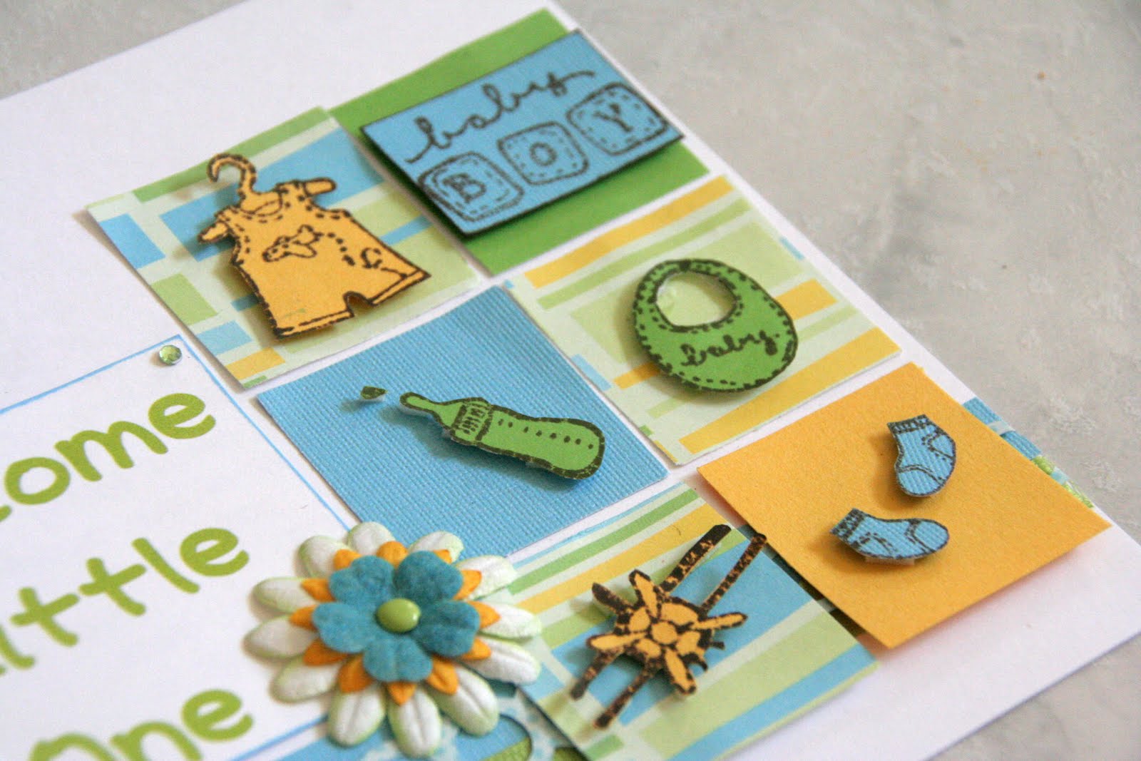
The second project I did was to make a card.  I find cards very difficult to make and I spend more time making a card than I do a layout, if you can believe it!  I find that I fuss so much more with a card and it just doesn't come naturally to me.  But, I'm glad I did one as I'm hoping that the more I do, the easier it will get (fingers crossed, at least).  And here's my card:


I changed up the sketch for my card.  I left out the circles on the right-hand side and I made six small blocks instead of three small ones and a big one.  I put the sentiment on a title block and added in a flower there.  I used scraps of paper for all of it and I decided to do some stamping.  I have some baby stamps so I stamped the images on to cardstock and then cut them out.  Then I adhered them with foam onto the blocks.  I used the stamped buttons as the circle cluster at the top.


And that's it for my projects!  I hope you enjoyed your stop here.  Make sure to leave a comment to be entered for Amanda's giveaway.  Your next stop is at Jennifer's blog:  http://scrapdrawer.blogspot.com/.  I'm sure she has some great projects in store for you!  Thanks for stopping by and Happy Hopping!

Zoom, Zoom, Zoom!

Park pictures with little ones - who doesn't love them?  :D  These pictures of when we went to a new park and A finally decided that he liked the slide.  Look at the smile on his face!


I used Stickles on the title, just to give it a little sparkle.


I used my "bubble" border punch and then filled some of the holes with orange gems.


All the chipboard - flowers, arrow, bracket, dots - are from a Pebbles pack that I got from a RAK.  I've used them so much.  I also included hidden journalling behind one photo.  Not that the journalling is very personalized but it didn't fit into my design.

Wednesday, June 1, 2011

El Huasito Aidan

I did this layout of when we went shopping for woollen and knitted clothes just north of Santiago.  We got A this little hauso (Chilean for cowboy) poncho but we tried on lots of other sweet clothes too!


These dimension flower stickers are from the "Wild Saffron" collection from K&Company.  I just love that collection!


And I actually misted here!  Yep, I pulled out my sole bottle of Smooch Spritz and misted the journalling spot.  That is one look I really like with mist.


I used my Leave It To Weaver punch to do the border at the bottom.  I threaded brown ribbon through it and then added small flower stickers from the same "Wild Saffron" pack.

Tuesday, May 31, 2011

Big Yawn

I started this layout back on iNSD.  I love these pictures of A yawning when he was a teeny tiny baby!  I started out by adding some blue ink along the top and bottom edges of the photos to serve as a mat.  Then I added the photos and the paper blocks.  The ric rac and buttons came next.  After that, I added the title, then the stitching and finally the journalling.


I added the flower on the title block but felt it needed something else so I added some flourishes to act as leaves.  The font I used for the title is Ravie and for the journalling, I used 2Peas Rubber Ducky.


I really like how the buttons turned out.  I wanted them to serve as a small border along the bottom.

Monday, May 30, 2011

Faces

I did this layout for a recipe challenge at Club CK.  Ashley asked us to include the colour yellow - check, chipboard - check, ribbon or floss - check, at least three buttons - check, letter stickers - check and glitter or Stickles - check!


The toughest part of this layout was trying to use letter stickers.  I never use them anymore but still have some in my stash.  I had no coordinating colours so I decided to put Stickles on the stickers to get them to match.  It worked out OK, but I'm still not a fan of letter stickers!  lol  I really couldn't think of a title for this layout - I just thought the expressions on A's face were so cute.  So, I journalled about that (on this super cute Jillibean Soup journalling spot) and then came up with a short, though boring, title based on that.  I needed to add something to the title area, so I put the stickers on a strip of ribbon, added buttons with yellow floss to either side and then a semi-circle of gems.  They aren't turquoise but they go with the background paper and I'm trying to get past my "everything has to match perfectly" hangup.


I used this little circle from the same Jillibean Soup pack and then mounted a small chipboard flower and then button on it.  I used foam to mount them all to give it dimension.


I love the journalling spot but it looked too plain by itself.  So, I decided to stitch a "border" around the scalloped circle.

Sunday, May 29, 2011

15-Minute Challenge

For this week's issue challenge, Erika asked us to do a layout in 15 minutes.  Yes, 15 minutes.  If you know me, I am a sssslllloooowwww scrapper.  I take forever to choose the papers to go with the pictures, then the embellies and then putting it all together.  Paper layouts take me much longer than digi ones but I'm still not speedy with digi layouts.  I still like to play around with the elements and then the shadowing.

So this challenge was an anxiety-provoking challenge for me but I wanted to give it a shot.  I chose the photos and the digi kit ("Leaps and Bounds" by Julie Billingsley) ahead of time.  I chose them a couple days ago and then let it be.  I sat down and started the timer.  I decided to forget about layering - not going to happen when I'm pressed for time.  So I went with a simple photo block and then the starburst, the buttons and the title.  I fussed around with the alphas to space them evenly and then line them up properly - I couldn't let that go - it would have driven me nuts.  I see the blue button is a little off but oh well, it's not too bad.  I couldn't let this layout go without journalling.  Yes, I'm a journalling junkie but I have to tell the stories to go with the photos.  There are layouts that I don't feel need journalling but this one wasn't one of those.


And you know what?  I'm really happy with it!  I need to do this more often.  :)